🚧 This site is a work in progress — New case studies and stories are coming soon. 🚀
IAG Data Design System
Building a Data Design System for IAG’s Analytics Ecosystem.
The idea of creating a data design system for IAG didn’t come out of nowhere.
It began at PepsiCo, where I was working with the design team on systems for web and mobile applications. When we tried to apply those same guidelines to Power BI, it just didn’t work: what made sense in traditional digital interfaces wasn’t viable in BI environments.
That mismatch pushed me to dig deeper. I realized that designing data products inside analytics tools required a different approach — with rules adapted to their context: from how colors behave in charts, to how templates, accessibility, and layout density are managed in environments built more for analysts than for designers.
That initial curiosity became the starting point for a bigger project: building a data design system that could be applied consistently across IAG’s analytics ecosystem — with Power BI as the first implementation, but a clear path to other tools and products within IAG Transform.
STEP 1
The problem I found
When I stepped into this new challenge, it quickly became clear that the analytics ecosystem was fragmented.
Each domain had its own style, KPIs were named differently, and makeshift templates were rarely reused. For users, moving from one report to another felt like switching languages — confusion, low adoption, and wasted time.

Overloaded with colors and icons, the dashboard lacks consistency and structure, making data hard to read and compare.

Weak color hierarchy and minimal labels make comparisons unclear, while the layout feels fragmented and lacks narrative flow.
STEP 2
Framing the needs
Before defining components or templates, I framed the needs by context, not as a visual refresh.
Users – data engineers, BI developers, analysts, and business stakeholders across domains.
Value – faster, more consistent analytics products that reduce cognitive load and build trust in the data.
Interfaces – dashboards in Power BI, pages in the Data Marketplace, and AI-assisted experiences such as IAG’s analytics chatbot.
Data & analytics – shared metric definitions, visual patterns for recurring questions (trend, comparison, deviation), and rules for how data appears across tools.
Governance & lifecycle – how the system would be maintained, extended to new tools, and aligned with brand and accessibility requirements.
Positioning the design system as a product made it easier to align with IAG Transform’s roadmap and to talk about return on investment beyond “better-looking dashboards”.
STEP 2
Uncovering the problems
I first needed to understand where the chaos was coming from.
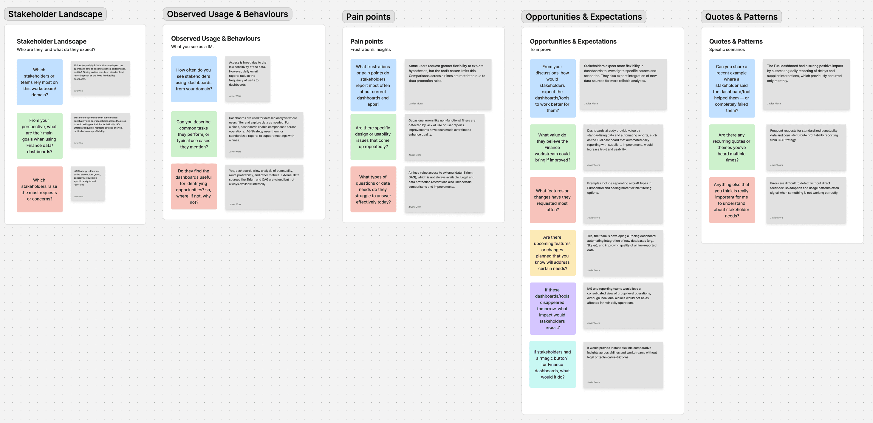
The first step was to listen and map the terrain: I reviewed over 50 dashboards, interviewed analysts and business owners, and identified repeating issues such as poor contrast, inconsistent naming, and the lack of visual standards.
"I spent more time trying to understand the dashboard than actually using the data to take action."
Operations stakeholder
19%
Clarity
Users struggled to interpret KPIs and follow data narratives.
25%
Consistency
Inconsistent design patterns across domains.
38%
Scalability
38% of misalignment stemmed from templates that couldn’t scale.
19%
Accessibility
Impact on limiting adoption across wider audiences.
19%
Clarity
Users struggled to interpret KPIs and follow data narratives.
25%
Consistency
Inconsistent design patterns across domains.
38%
Scalability
38% of misalignment stemmed from templates that couldn’t scale.
19%
Accessibility
Impact on limiting adoption across wider audiences.
% of misalignment issues detected by principle across audited dashboards.
I realized that while data teams were highly focused on tools to speed up processing, cleaning, and reporting, what was missing was a product mindset — the kind digital product teams rely on.
Bringing in a UX perspective meant working side by side with Data Scientists, Analysts, Governance, and Business Owners to connect their needs into a shared vision.
To do this, I ran formal and informal interviews, mapping recurring pain points and discussing ideas together.
This became the foundation for uncovering the problems that the design system would later address.
STEP 3
The result
From the fragmented dashboards I uncovered — overloaded visuals, inconsistent naming, and the absence of visual standards — I moved to a data design system with clear, easy-to-apply rules.
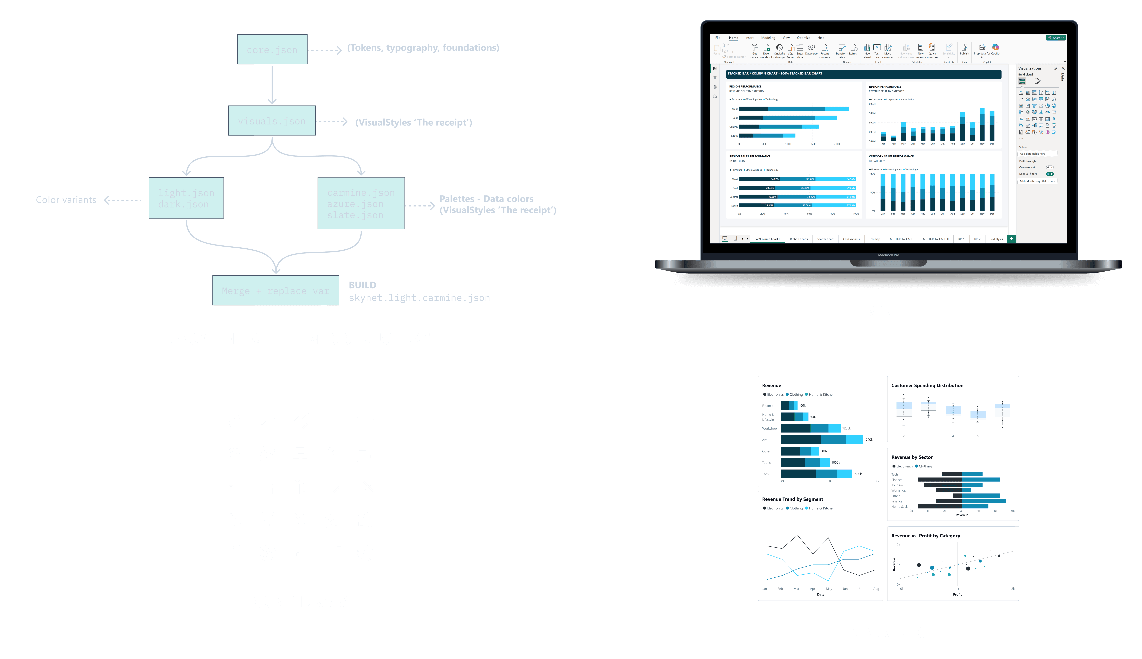
Instead of building dashboards from scratch in each team, I introduced a shared asset library and a set of patterns that could live across tools:
Chart patterns designed once and reused across products.
UI elements with style presets for navigation, filters, and KPI blocks.
Icon sets and layout templates aligned with IAG’s brand and accessibility requirements.
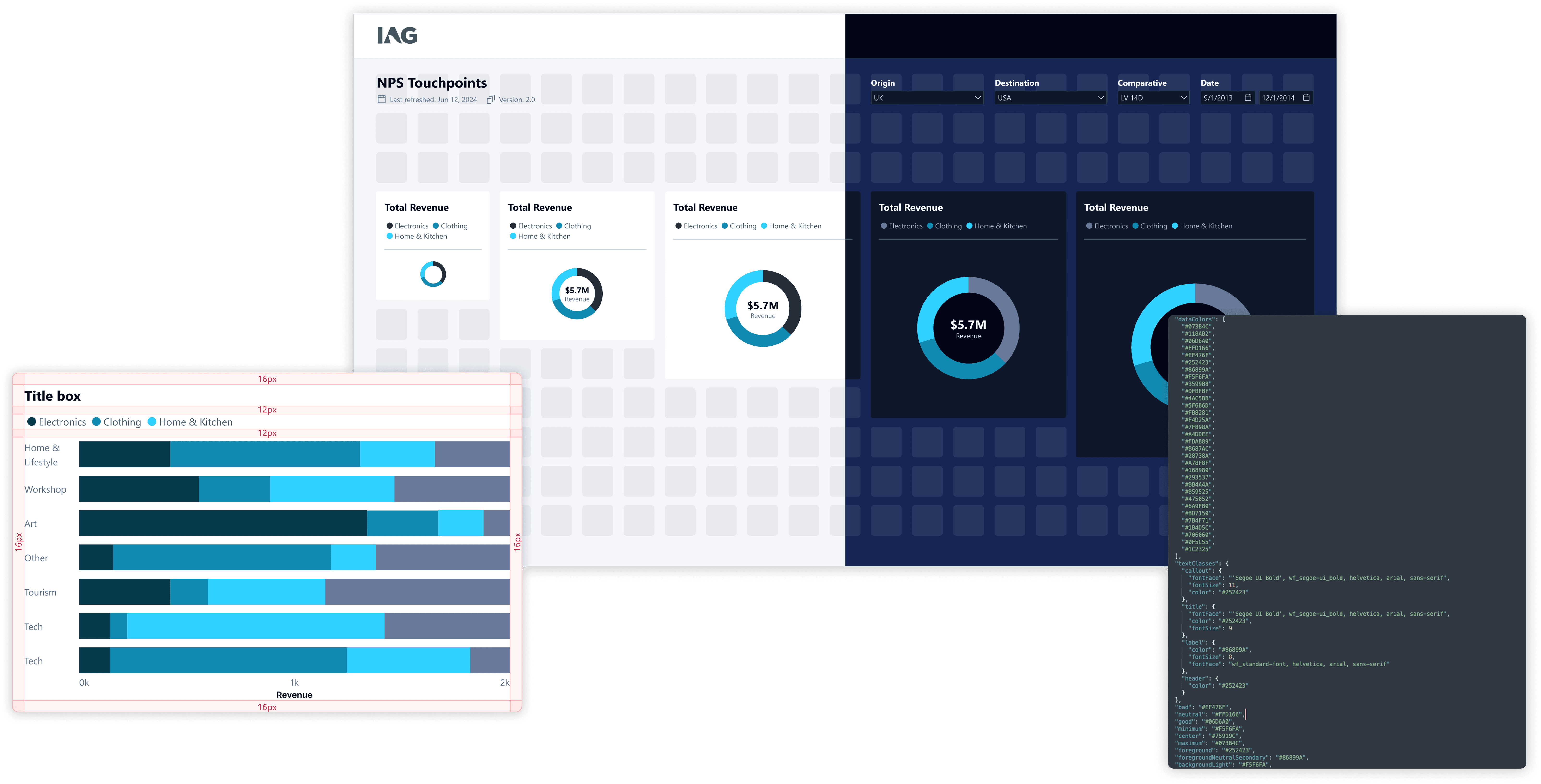
Power BI became the first implementation of this system, but the rules were documented to scale to other environments inside IAG Transform.
What this Data Design System includes
Inspired by work on dataviz style guides from Maxene Graze and others, I structured the system around a few core components:
Color
Functional palettes for neutral backgrounds, categorical series, semantic alerts, and highlights.
Typography
Type scales optimised for dense, analytical interfaces.
Chart patterns
When and how to use bars, lines, deviations, compositions, distributions, and small multiples.
Layout & hierarchy
Grid and spacing rules that make dashboards feel familiar and reduce cognitive load.
Accessibility
Minimum contrast, clear labeling, and patterns that work for a wider range of users.
These components were intentionally designed to be **tool-agnostic**, while being implemented first in Power BI as the main delivery channel.
System deliverables across the analytics stack
To make the results sustainable, the design rules were translated into tangible deliverables that both designers and analysts could use in their daily work.
A Figma library as the visual source of truth for layouts, components, and chart patterns;
Power BI JSON theme files and a reference .PBIX file to bring the system into the main BI environment;
A specification layer that informs how the same patterns should be implemented in other IAG Transform tools, such as the Data Marketplace and AI-driven interfaces;
A governance guide explaining how to request new patterns, extend the system, and keep it aligned with brand and accessibility standards.
Together, these deliverables became a single source of truth for how data should look and behave across IAG’s analytics ecosystem.

The asset library became the foundation of the Design System — turning Power BI into a faster, scalable, and more user-friendly environment.
STEP 4
The impact
In just a few weeks, the change was visible: the time needed to create a dashboard dropped from two weeks to just four days.
Visual consistency improved by more than 75%, making reports easier to read and compare. Most importantly, stakeholders began to trust dashboards again, because the information was finally presented in a way they could understand effortlessly — and the experience felt familiar across different products.
Onboarding
7 days
vs 30 days
New analysts adopted the design system in jus one week, cutting the learning curve by 75%.
ADOPTION INCREASED
60%
vs Low Adoption
Most teams can now rely on templates and guidelines as their default starting point.
ONBOARDING
7 days
vs 30 days
New analysts adopted the design system in jus one week, cutting the learning curve by 75%.
What I learned
A data design system isn’t “extra decoration.” It’s a strategic layer that multiplies impact: it speeds up the creation of analytics products, improves adoption, and builds trust in the data.
This project confirmed for me that in the world of data products, design needs its own approach — grounded in governance, patterns, and real constraints — to truly be useful and scalable.
Next steps
The next step I want to materialize is a centralized, living style guide for data visualization within IAG Transform — a true single source of truth that data teams can use to design, build, and maintain analytics products (in Power BI and beyond) with clarity and confidence.
🚧 This site is a work in progress — New case studies and stories are coming soon. 🚀
IAG Data Design System
Building a Data Design System for IAG’s Analytics Ecosystem.
The idea of creating a data design system for IAG didn’t come out of nowhere.
It began at PepsiCo, where I was working with the design team on systems for web and mobile applications. When we tried to apply those same guidelines to Power BI, it just didn’t work: what made sense in traditional digital interfaces wasn’t viable in BI environments.
That mismatch pushed me to dig deeper. I realized that designing data products inside analytics tools required a different approach — with rules adapted to their context: from how colors behave in charts, to how templates, accessibility, and layout density are managed in environments built more for analysts than for designers.
That initial curiosity became the starting point for a bigger project: building a data design system that could be applied consistently across IAG’s analytics ecosystem — with Power BI as the first implementation, but a clear path to other tools and products within IAG Transform.
STEP 1
The problem I found
When I stepped into this new challenge, it quickly became clear that the analytics ecosystem was fragmented.
Each domain had its own style, KPIs were named differently, and makeshift templates were rarely reused. For users, moving from one report to another felt like switching languages — confusion, low adoption, and wasted time.
Overloaded with colors and icons, the dashboard lacks consistency and structure, making data hard to read and compare.
Weak color hierarchy and minimal labels make comparisons unclear, while the layout feels fragmented and lacks narrative flow.
STEP 2
Framing the needs
Before defining components or templates, I framed the needs by context, not as a visual refresh.
Users – data engineers, BI developers, analysts, and business stakeholders across domains.
Value – faster, more consistent analytics products that reduce cognitive load and build trust in the data.
Interfaces – dashboards in Power BI, pages in the Data Marketplace, and AI-assisted experiences such as IAG’s analytics chatbot.
Data & analytics – shared metric definitions, visual patterns for recurring questions (trend, comparison, deviation), and rules for how data appears across tools.
Governance & lifecycle – how the system would be maintained, extended to new tools, and aligned with brand and accessibility requirements.
Positioning the design system as a product made it easier to align with IAG Transform’s roadmap and to talk about return on investment beyond “better-looking dashboards”.
STEP 2
Uncovering the problems
I first needed to understand where the chaos was coming from.
The first step was to listen and map the terrain: I reviewed over 50 dashboards, interviewed analysts and business owners, and identified repeating issues such as poor contrast, inconsistent naming, and the lack of visual standards.
"I spent more time trying to understand the dashboard than actually using the data to take action."
Operations stakeholder
19%
Clarity
Users struggled to interpret KPIs and follow data narratives.
25%
Consistency
Inconsistent design patterns across domains.
38%
Scalability
38% of misalignment stemmed from templates that couldn’t scale.
19%
Accessibility
Impact on limiting adoption across wider audiences.
19%
Clarity
Users struggled to interpret KPIs and follow data narratives.
25%
Consistency
Inconsistent design patterns across domains.
38%
Scalability
38% of misalignment stemmed from templates that couldn’t scale.
19%
Accessibility
Impact on limiting adoption across wider audiences.
% of misalignment issues detected by principle across audited dashboards.
I realized that while data teams were highly focused on tools to speed up processing, cleaning, and reporting, what was missing was a product mindset — the kind digital product teams rely on.
Bringing in a UX perspective meant working side by side with Data Scientists, Analysts, Governance, and Business Owners to connect their needs into a shared vision.
To do this, I ran formal and informal interviews, mapping recurring pain points and discussing ideas together.
This became the foundation for uncovering the problems that the design system would later address.
STEP 3
The result
From the fragmented dashboards I uncovered — overloaded visuals, inconsistent naming, and the absence of visual standards — I moved to a data design system with clear, easy-to-apply rules.
Instead of building dashboards from scratch in each team, I introduced a shared asset library and a set of patterns that could live across tools:
Chart patterns designed once and reused across products.
UI elements with style presets for navigation, filters, and KPI blocks.
Icon sets and layout templates aligned with IAG’s brand and accessibility requirements.
Power BI became the first implementation of this system, but the rules were documented to scale to other environments inside IAG Transform.
What this Data Design System includes
Inspired by work on dataviz style guides from Maxene Graze and others, I structured the system around a few core components:
Color
Functional palettes for neutral backgrounds, categorical series, semantic alerts, and highlights.
Typography
Type scales optimised for dense, analytical interfaces.
Chart patterns
When and how to use bars, lines, deviations, compositions, distributions, and small multiples.
Layout & hierarchy
Grid and spacing rules that make dashboards feel familiar and reduce cognitive load.
Accessibility
Minimum contrast, clear labeling, and patterns that work for a wider range of users.
These components were intentionally designed to be **tool-agnostic**, while being implemented first in Power BI as the main delivery channel.
System deliverables across the analytics stack
To make the results sustainable, the design rules were translated into tangible deliverables that both designers and analysts could use in their daily work.
A Figma library as the visual source of truth for layouts, components, and chart patterns;
Power BI JSON theme files and a reference .PBIX file to bring the system into the main BI environment;
A specification layer that informs how the same patterns should be implemented in other IAG Transform tools, such as the Data Marketplace and AI-driven interfaces;
A governance guide explaining how to request new patterns, extend the system, and keep it aligned with brand and accessibility standards.
Together, these deliverables became a single source of truth for how data should look and behave across IAG’s analytics ecosystem.
The asset library became the foundation of the Design System — turning Power BI into a faster, scalable, and more user-friendly environment.
STEP 4
The impact
In just a few weeks, the change was visible: the time needed to create a dashboard dropped from two weeks to just four days.
Visual consistency improved by more than 75%, making reports easier to read and compare. Most importantly, stakeholders began to trust dashboards again, because the information was finally presented in a way they could understand effortlessly — and the experience felt familiar across different products.
Onboarding
7 days
vs 30 days
New analysts adopted the design system in jus one week, cutting the learning curve by 75%.
ADOPTION INCREASED
60%
vs Low Adoption
Most teams can now rely on templates and guidelines as their default starting point.
ONBOARDING
7 days
vs 30 days
New analysts adopted the design system in jus one week, cutting the learning curve by 75%.
What I learned
A data design system isn’t “extra decoration.” It’s a strategic layer that multiplies impact: it speeds up the creation of analytics products, improves adoption, and builds trust in the data.
This project confirmed for me that in the world of data products, design needs its own approach — grounded in governance, patterns, and real constraints — to truly be useful and scalable.
Next steps
The next step I want to materialize is a centralized, living style guide for data visualization within IAG Transform — a true single source of truth that data teams can use to design, build, and maintain analytics products (in Power BI and beyond) with clarity and confidence.